A cross platform UI Design for humanizing financial services
Harvest:
A warmer approach to digital banking
Overview
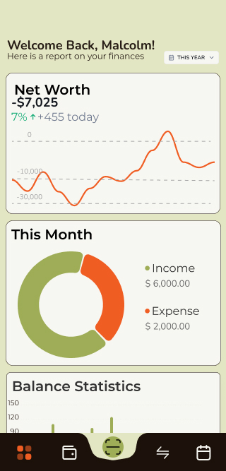
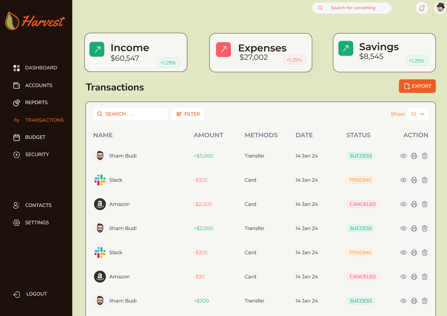
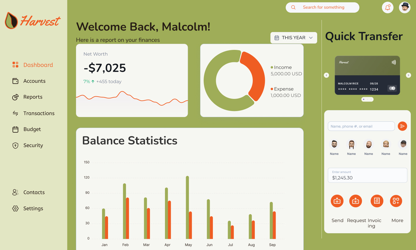
Harvest is a fictional digital bank designed to compete with legacy financial institutions by offering a warmer, more human-centered experience. The interface supports desktop, tablet, and mobile devices — with a responsive system designed to feel unified, intuitive, and visually distinct across screen sizes.
Problem
Traditional banking interfaces often feel cold and uninviting, leading to user disengagement.
Solution
I designed a warm, responsive UI that fosters user engagement and trust while simplifying banking tasks.
Student Project
Type
Role
UI Designer
Tools
Figma
Timeline
5 months
Design Process
1
Research
2
Planning
3
Iterations
4
Reflections
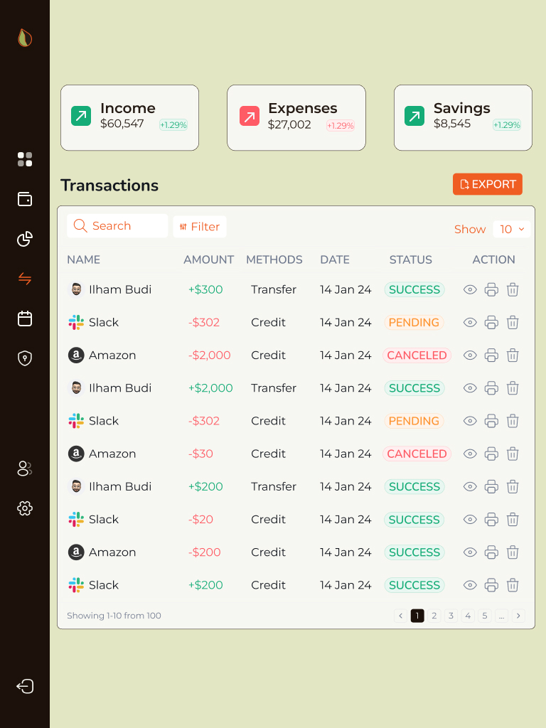
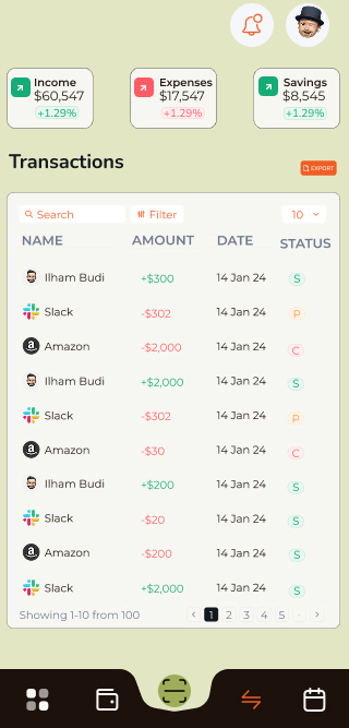
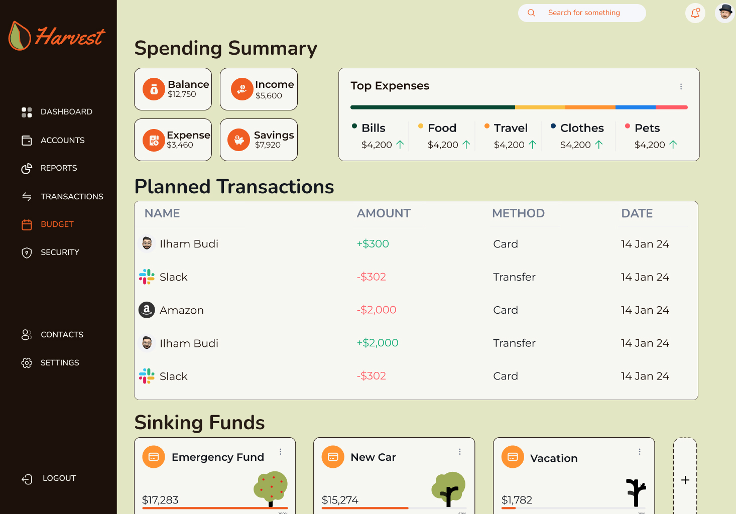
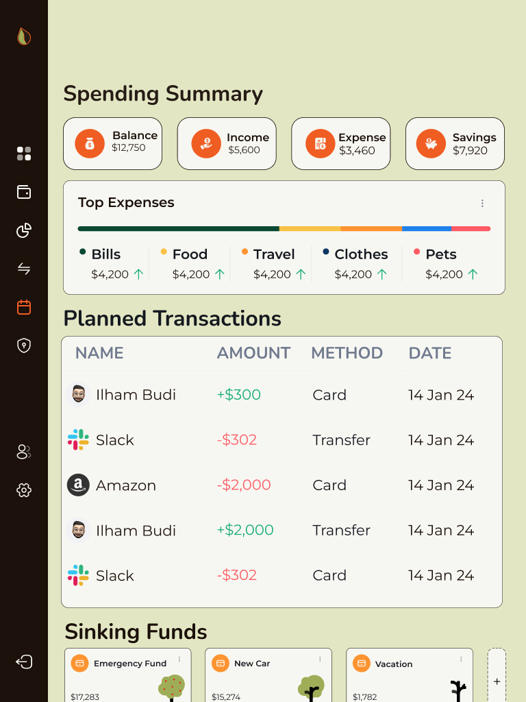
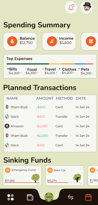
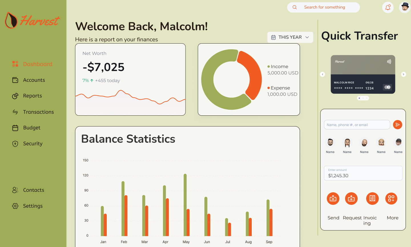
Final Designs
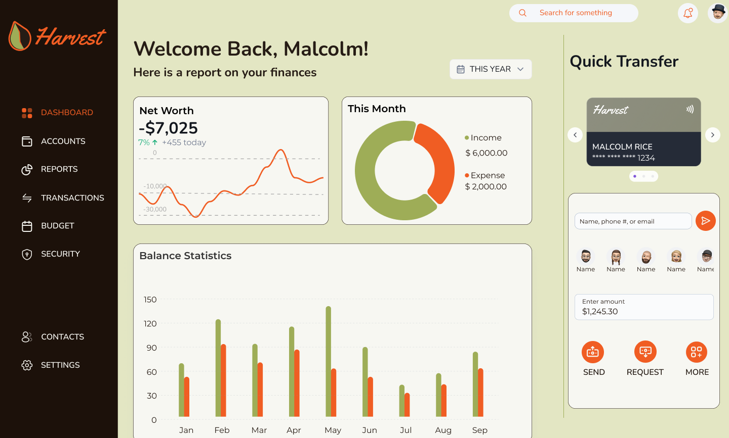
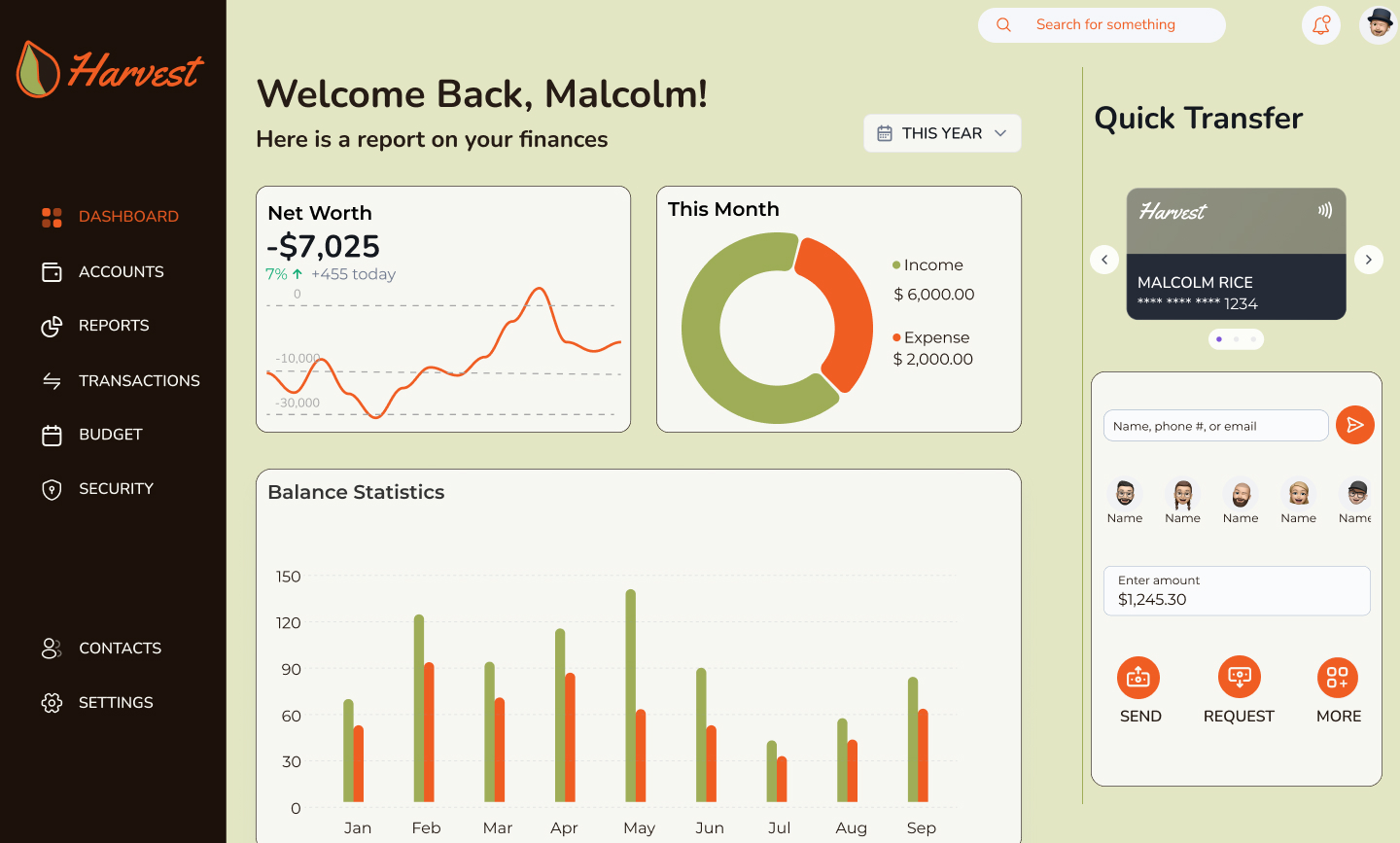
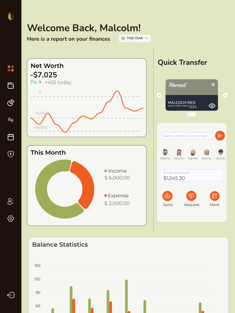
Responsive design was a top priority from the start. Each layout was purpose-built for the context in which users access banking services.
Careful attention was given to maintaining visual and functional consistency across all three device types while respecting their different use cases.
The final UI design is clean, responsive, and rooted in a visual system that feels unique but appropriate for the financial space. The design expresses warmth without sacrificing clarity, supporting both casual and power users.
Moodboards
Before diving into the UI, I explored branding and design approaches from a range of other UI designs and images. The themes of Clear, Playful, and Trustworthy were priority. Some inspiration came from competitors (e.g., Barclays), while other images showcased inviting illustration techniques, earthy color palettes, and user-first design systems.
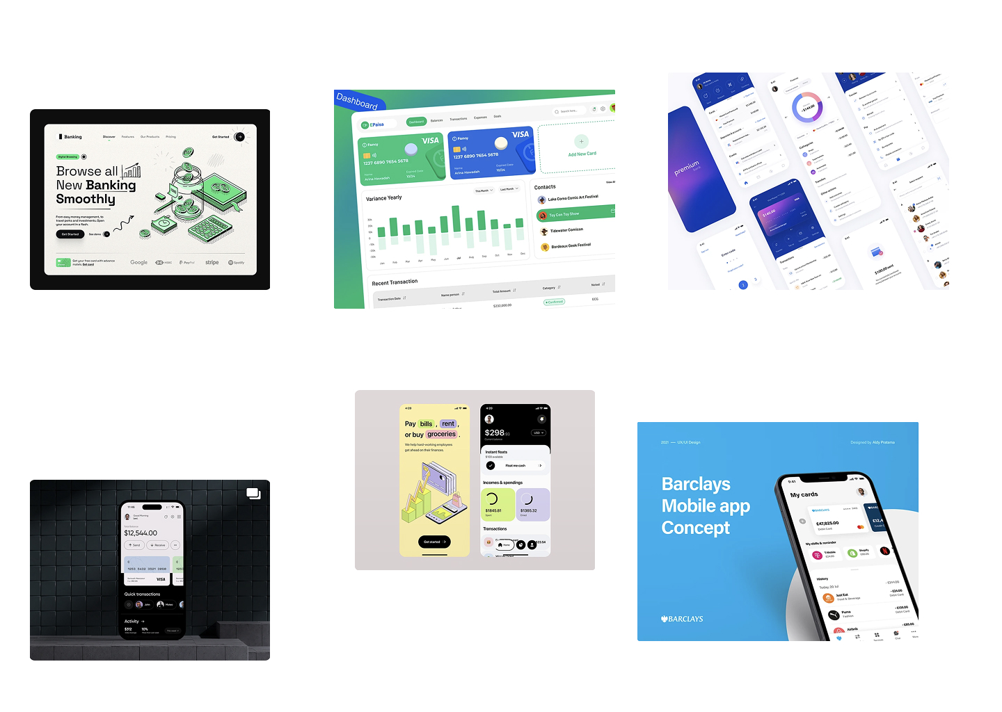
Trustworthy
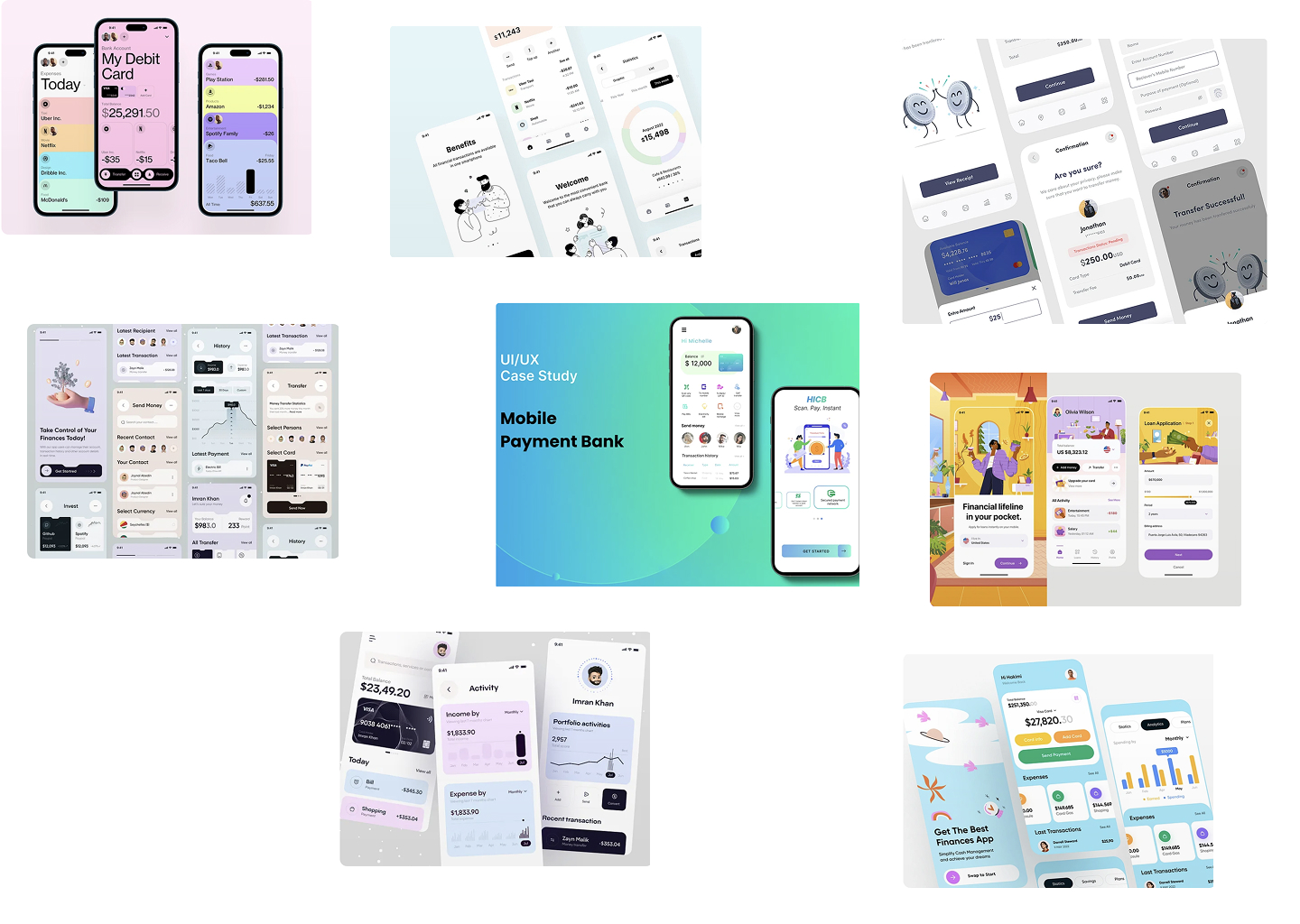
Playful
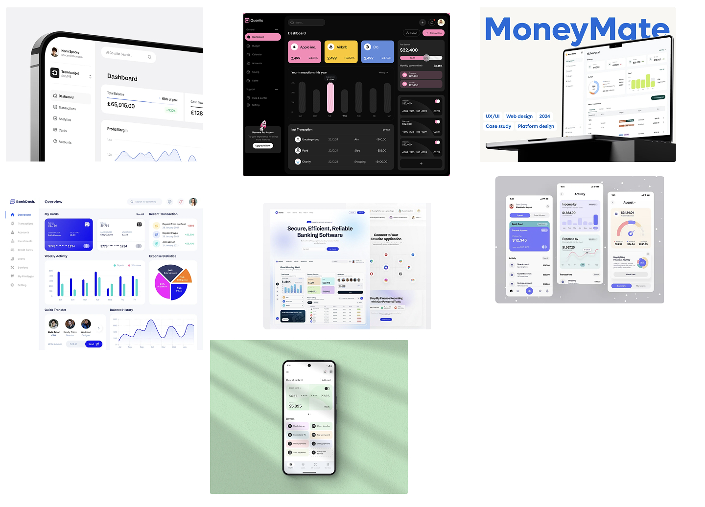
Clear
UI elements
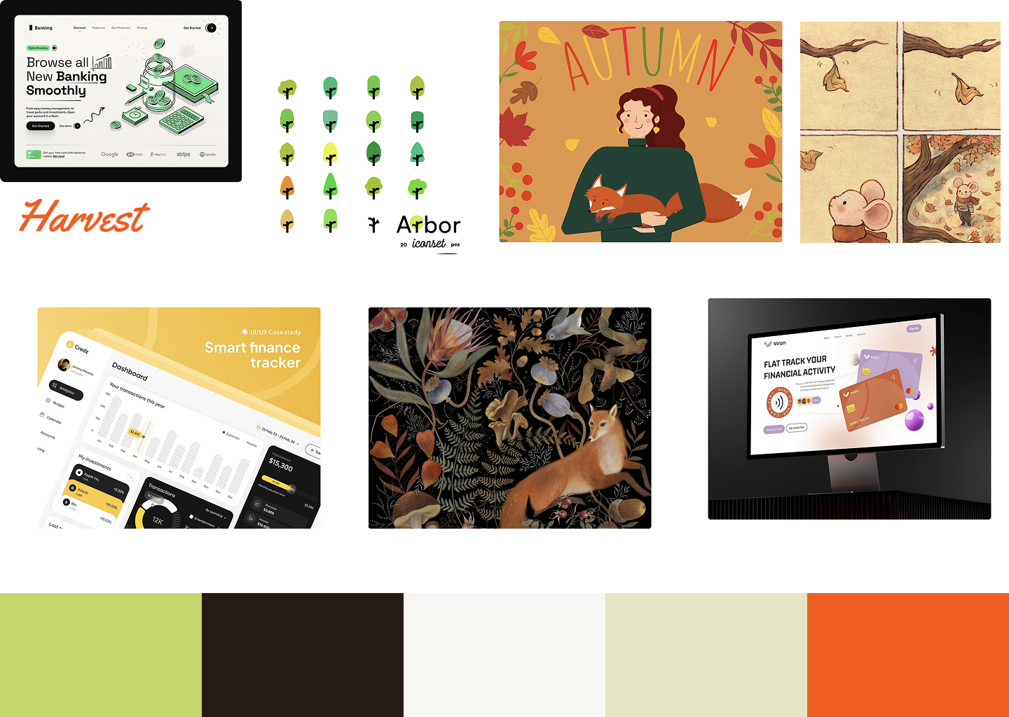
The name Harvest inspired an autumnal theme — I looked for images that evoked maturity, warmth, and abundance, while still feeling sleek and modern.
Grids
A 4-point spacing system and 12-column grid (for desktop) were implemented to ensure structure across breakpoints. These systems supported a cohesive rhythm across screens and minimized layout inconsistencies.
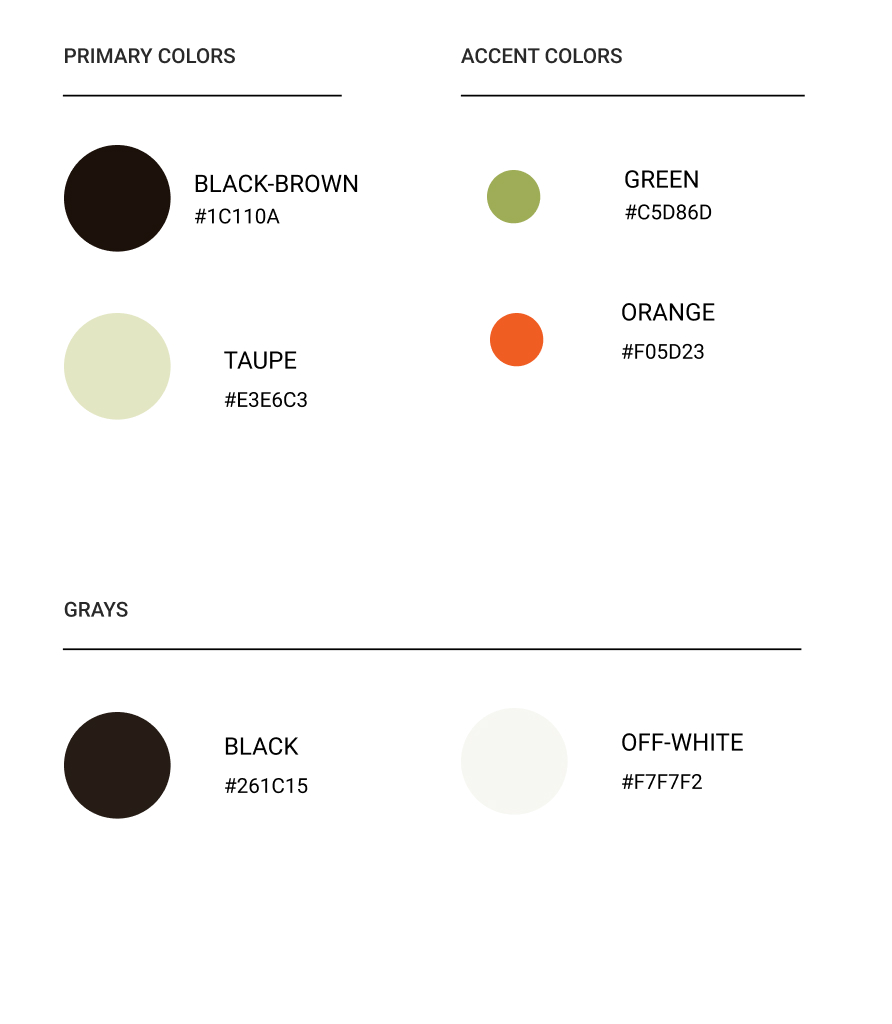
Color
The palette began with brighter greens to reflect growth but shifted toward richer, darker hues — inspired by the fall harvest. This made the interface easier on the eyes, more grounded, and in line with user expectations from a financial brand.
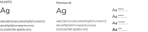
Typography
Typography was a challenge — balancing clarity with brand personality required multiple iterations. I tested combinations for hierarchy, readability, and tone. Though I landed on a clean, sans-serif pair, I noted areas for improvement in scale and responsiveness.
Iconography
I used an open-source icon library for consistency and speed. Icons were chosen for clarity and alignment with the brand’s tone: trustworthy but warm, minimal but expressive.
Iterations
The project went through several iterations. In each I explored:
- Layout density and visual rhythm
- Color and contrast for accessibility
- Typographic scale adjustments
Throughout the process, I prioritized:
- Creating reusable components to support responsiveness
- Color and type accessibility
- Using color and spacing to guide users' attention naturally
Conclusion & Reflection
This project taught me a lot about balancing creative vision with functional design systems.
Key takeaways:
- I’m especially proud of the refined color palette — it brought personality and tone to the interface.
- Typography was a learning curve. In future projects, I’d invest more time upfront creating a flexible, well-structured type scale.
- Responsive components are critical — building them early saves time and improves consistency.
If I had more time, I would:
- Rebuild the type hierarchy from scratch to avoid manual overrides
- Explore microinteractions to enrich the UI experience
- Conduct user testing to validate usability and visual hierarchy
This design serves as a thoughtful, brand-aligned response to the challenge of making banking feel more human — from first glance to last interaction.
A cross platform UI Design for humanizing financial services
Harvest: A warmer approach to digital banking
Overview
Harvest is a fictional digital bank designed to compete with legacy financial institutions by offering a warmer, more human-centered experience. The interface supports desktop, tablet, and mobile devices — with a responsive system designed to feel unified, intuitive, and visually distinct across screen sizes.
Problem
Traditional banking interfaces often feel cold and uninviting, leading to user disengagement.
Solution
I designed a warm, responsive UI that fosters user engagement and trust while simplifying banking tasks.
Type
Student Project
Role
UI Designer
Tools
Figma
Timeline
5 months
Design Process
1
Research
2
Planning
3
Iterations
4
Reflections
Responsive design was a top priority from the start. Each layout was purpose-built for the context in which users access banking services.
Careful attention was given to maintaining visual and functional consistency across all three device types while respecting their different use cases.
The final UI design is clean, responsive, and rooted in a visual system that feels unique but appropriate for the financial space. The design expresses warmth without sacrificing clarity, supporting both casual and power users.
Final Designs
Before diving into the UI, I explored branding and design approaches from a range of other UI designs and images. The themes of Clear, Playful, and Trustworthy were priority. Some inspiration came from competitors (e.g., Barclays), while other images showcased inviting illustration techniques, earthy color palettes, and user-first design systems.
Playful
Clear
Trustworthy
Moodboards
UI elements
The name Harvest inspired an autumnal theme — I looked for images that evoked maturity, warmth, and abundance, while still feeling sleek and modern.
Grids
A 4-point spacing system and 12-column grid (for desktop) were implemented to ensure structure across breakpoints. These systems supported a cohesive rhythm across screens and minimized layout inconsistencies.
Color
The palette began with brighter greens to reflect growth but shifted toward richer, darker hues — inspired by the fall harvest. This made the interface easier on the eyes, more grounded, and in line with user expectations from a financial brand.
Typography
Typography was a challenge — balancing clarity with brand personality required multiple iterations. I tested combinations for hierarchy, readability, and tone. Though I landed on a clean, sans-serif pair, I noted areas for improvement in scale and responsiveness.
Iconography
I used an open-source icon library for consistency and speed. Icons were chosen for clarity and alignment with the brand’s tone: trustworthy but warm, minimal but expressive.
The project went through several iterations. In each I explored:
- Layout density and visual rhythm
- Color and contrast for accessibility
- Typographic scale adjustments
Throughout the process, I prioritized:
- Creating reusable components to support responsiveness
- Color and type accessibility
- Using color and spacing to guide users' attention naturally
Iterations
This project taught me a lot about balancing creative vision with functional design systems.
Key takeaways:
- I’m especially proud of the refined color palette — it brought personality and tone to the interface.
- Typography was a learning curve. In future projects, I’d invest more time upfront creating a flexible, well-structured type scale.
- Responsive components are critical — building them early saves time and improves consistency.
If I had more time, I would:
- Rebuild the type hierarchy from scratch to avoid manual overrides
- Explore microinteractions to enrich the UI experience
- Conduct user testing to validate usability and visual hierarchy
This design serves as a thoughtful, brand-aligned response to the challenge of making banking feel more human — from first glance to last interaction.
Conclusion & Reflection
A cross platform UI Design for humanizing financial services
Harvest: A warmer approach to digital banking
Overview
Harvest is a fictional digital bank designed to compete with legacy financial institutions by offering a warmer, more human-centered experience. The interface supports desktop, tablet, and mobile devices — with a responsive system designed to feel unified, intuitive, and visually distinct across screen sizes.
Problem
Traditional banking interfaces often feel cold and uninviting, leading to user disengagement.
Solution
I designed a warm, responsive UI that fosters user engagement and trust while simplifying banking tasks.
Type
Student Project
Role
UI Designer
Tools
Figma
Timeline
5 months
Design Process
1
Research
2
Planning
3
Iterations
4
Reflections
Responsive design was a top priority from the start. Each layout was purpose-built for the context in which users access banking services.
Careful attention was given to maintaining visual and functional consistency across all three device types while respecting their different use cases.
The final UI design is clean, responsive, and rooted in a visual system that feels unique but appropriate for the financial space. The design expresses warmth without sacrificing clarity, supporting both casual and power users.
Final Designs
Moodboards
Before diving into the UI, I explored branding and design approaches from a range of other UI designs and images. The themes of Clear, Playful, and Trustworthy were priority. Some inspiration came from competitors (e.g., Barclays), while other images showcased inviting illustration techniques, earthy color palettes, and user-first design systems.
Playful
Clear
Trustworthy
UI elements
The name Harvest inspired an autumnal theme — I looked for images that evoked maturity, warmth, and abundance, while still feeling sleek and modern.
Grids
A 4-point spacing system and 12-column grid (for desktop) were implemented to ensure structure across breakpoints. These systems supported a cohesive rhythm across screens and minimized layout inconsistencies.
Color
The palette began with brighter greens to reflect growth but shifted toward richer, darker hues — inspired by the fall harvest. This made the interface easier on the eyes, more grounded, and in line with user expectations from a financial brand.
Typography
Typography was a challenge — balancing clarity with brand personality required multiple iterations. I tested combinations for hierarchy, readability, and tone. Though I landed on a clean, sans-serif pair, I noted areas for improvement in scale and responsiveness.
Iconography
I used an open-source icon library for consistency and speed. Icons were chosen for clarity and alignment with the brand’s tone: trustworthy but warm, minimal but expressive.
The project went through several iterations. In each I explored:
- Layout density and visual rhythm
- Color and contrast for accessibility
- Typographic scale adjustments
Throughout the process, I prioritized:
- Creating reusable components to support responsiveness
- Color and type accessibility
- Using color and spacing to guide users' attention naturally
Iterations
This project taught me a lot about balancing creative vision with functional design systems.
Key takeaways:
- I’m especially proud of the refined color palette — it brought personality and tone to the interface.
- Typography was a learning curve. In future projects, I’d invest more time upfront creating a flexible, well-structured type scale.
- Responsive components are critical — building them early saves time and improves consistency.
If I had more time, I would:
- Rebuild the type hierarchy from scratch to avoid manual overrides
- Explore micro-interactions to enrich the UI experience
- Conduct user testing to validate usability and visual hierarchy
This design serves as a thoughtful, brand-aligned response to the challenge of making banking feel more human — from first glance to last interaction.
Conclusion & Reflection